Top 5 Modern Graphic Design Trends Edited by Arunabh at 2016-04-28 15:42
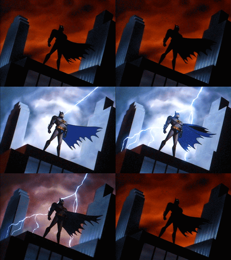
During the past few years, you must have noticed that there has been a huge Design trend going on that has completely changed the face of everything. The modern trend has ditched Skeumorphic Design and moved towards Flat and Minimal designs that looks cleaner and much pleasing to the eyes. They are influenced by culture and media, past and present, technology, fashion and other industries. Industries now pays serious attention to Design as well while developing their app, websites, products, branding, packaging, advertisement, etc. Although, design trends come and go, but an aesthetics becomes popular gradually over time and then then disappear without much notice at all. So, here i'm going to list my picks for the "Top 5 Graphic Design Trends" that you should be aware of in 2016. Even if you are not a Designer, it's smart to be aware of the shifts thats happening in the industry. 1. MATERIAL DESIGN Material Design is Google's own Design Language. This Visual Language is characterized by deliberated color choices, edge-to-edge imagery, large typography and intentional white spaces. Google states that their new design language is based on paper and ink. It makes use of grid-based layouts, responsive animations and transitions, padding, and depth effects such as lighting and shadows. Some are reffering to material design as "Flat 2.0" because, in many ways, its an update to the flat design trend adding light, shadow, depth and movement for a more tactile sense of realism. Though Google created it for web and mobile, you will see material design principles being used in all kinds of design formats. 

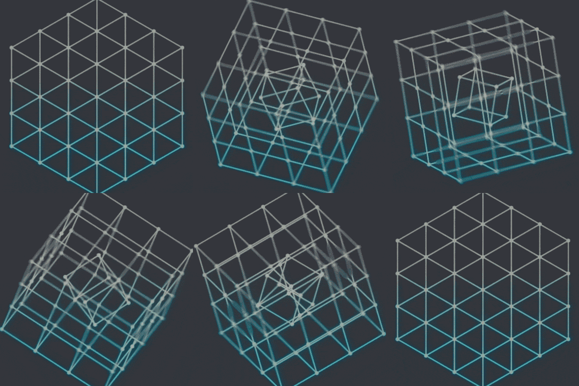
2. LOW POLY ART Low poly represents a polygon mesh in 3D graphics that has a rather small number of polygons. Low poly meshes are present in real-time applications and contrast with high poly meshes in animations or movies. The term low poly is used in both a technical and a descr iptive sense; the number of polygons in a mesh is an important factor to optimize for performance but can give an undesirable appearance to the resulting graphics. In simple words, these are sharp surfaces with simple geometric shapes, beautified with interesting textures by designers to create really cool looking 3D models. 

3. MODERN RETRO STYLE As opposed to vintage or “old” retro -- styles that draw from the early 1900s through the 60s -- “modern” retro takes its stylistic influences from more recent decades, the late 1970s through the 90s. Think early PCs and video games, pixel art, and space themes: nerdy is the new cool. 

4. MODULAR DESIGN Modular or card-based layouts have been adopted by some of the biggest brands for their websites and mobile apps. But organizing designs (of all mediums) according to a grid is nothing new. It’s the self-contained modules or cards used as the primary organizational principle that has created the twist of this new trend. 

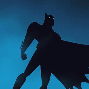
5. ABSTRACT MINIMALISTIC DESIGN In contrast to the more flamboyant, 1980s-inspired design styles we’ve seen so far, this trend relies on minimalism and deconstructing or distorting recognizable forms. This design integrates geometric shapes and bright colors like some of the other designs we’ve looked at, but do so in a simplistic way, with plenty of white space and a seemingly random layout. 

| |
SignatureNot just a fan. Passionate about Meizu. |
|
|
cool
| |
|
|
|
|
Nice write-up man!
| |
|
|
|
|
Also, PM Jack to push this thread to Home page
| |
|
|
|
|
Great job creating this thread...
| |
|
|
|
|
Fantastic share.
| |
|
|
|
|
Good job brother
| |
|
|
|
Arunabh replied at 2016-04-28 15:51 That's why I added it as Digest... | |
|
|
|
|
Excellent thread.
| |
|
|
|
Rudraksh replied at 2016-04-28 15:47 Thanks! invested quite a lot of time in writing this post | |
|
Edited by Rudraksh at 2016-04-28 15:48
Awesome Share bro! The Designer's Post | |
|
|
|


10